Use CSS subgrid to align deeply nested text.
The app I work on needed to align two columns of text, but the nesting made it hard to control. CSS subgrid to the resque!

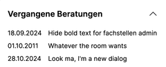
The HTML structure was like something like this. I've simplified it here.
<ul>
	<li>
		<span class="date">31.01.2024</span>
		<span class="title">Further Higher Deeper</span>
	</li>
	<li>
		<span class="date">19.11.2024</span>
		<span class="title">Some title</span>
	</li>
	<li>
		<span class="date">01.11.2011</span>
		<span class="title">Some title from a while ago.</span>
	</li>
</ul>
Normally I'd maybe use display: flex on the <li> element, but that forces me to set a specific width for the the date element. I want the browser to make that desition for me. Or alternatively display: grid on the <ul> element, but that would make the <li>’s into grid-items, leaving me with no control of the <span>’s.
Subgrid solves this for me though. But before going into subgrid, lets pretend we can do this as a normal CSS grid set-up, and forget about the extra nesting for a bit.
ul {
	display: grid;
	grid-template-columns: min-content 1fr;
	column-gap: 1em;
}
Using min-content for the first column makes the first column size to the width of the least narrow span with the dates. Or rather, it will make it so, once subgrid comes to play.
As it is now, the grid is affecting the <li>, not the nested <span>.
So we'll add a display: grid to the li as well. But instead of specifying the sizing of the grid template columns, I'm setting it to subgrid with: grid-template-columns: subgrid;.
li {
	/* Grid item specific:
	 * Span from first to last column of the parent grid.
	 */
	grid-column: 1 / -1;

	/*  Subgrid specific:
	 *  Define the nested grid
	 */
	display: grid;

	/* Inherit the parent’s grid columns for _my_ children!
	 * Which are: min-content 1fr;
	 */
	grid-template-columns: subgrid;
}
If I was to just repeat grid-template-columns: min-content 1fr; on the li elements, each one of them would be an indepent grid without knowledge of the neighbouring grids. But with the subgrid value, they know to look for the parent.
And when the parent also sees this min-content value, the browser checks for each of the date-spans’ widths, and passes that same value back down to each of the subgrids. And now they are perfectly aligned. Ta-da! 🎉
See the Pen Align text with subgrid by Eystein Mack Alnaes (@eystein) on CodePen.
- Previous: What is web accessibility?